An identity made
to work.
Beratech
Industrials
A visual identity with a practical life. A connected system for an industrial business, from the mark and its rules to the documents, uniforms, and spaces that carry it.
Explore the work
- CLIENT
- Beratech Industrials
- DISCIPLINE
- Brand identity & print design
- DESIGN
- Kyasanku Charles Nyombi
- DELIVERABLES
- Brand guidelines
Print kit
A4 stationery system
One identity.
A whole working world.
Beratech’s world spans industrial parts, tools, workshops, and sites. The identity needs to stay recognisable on a business card, a document, a uniform, or a delivery vehicle.
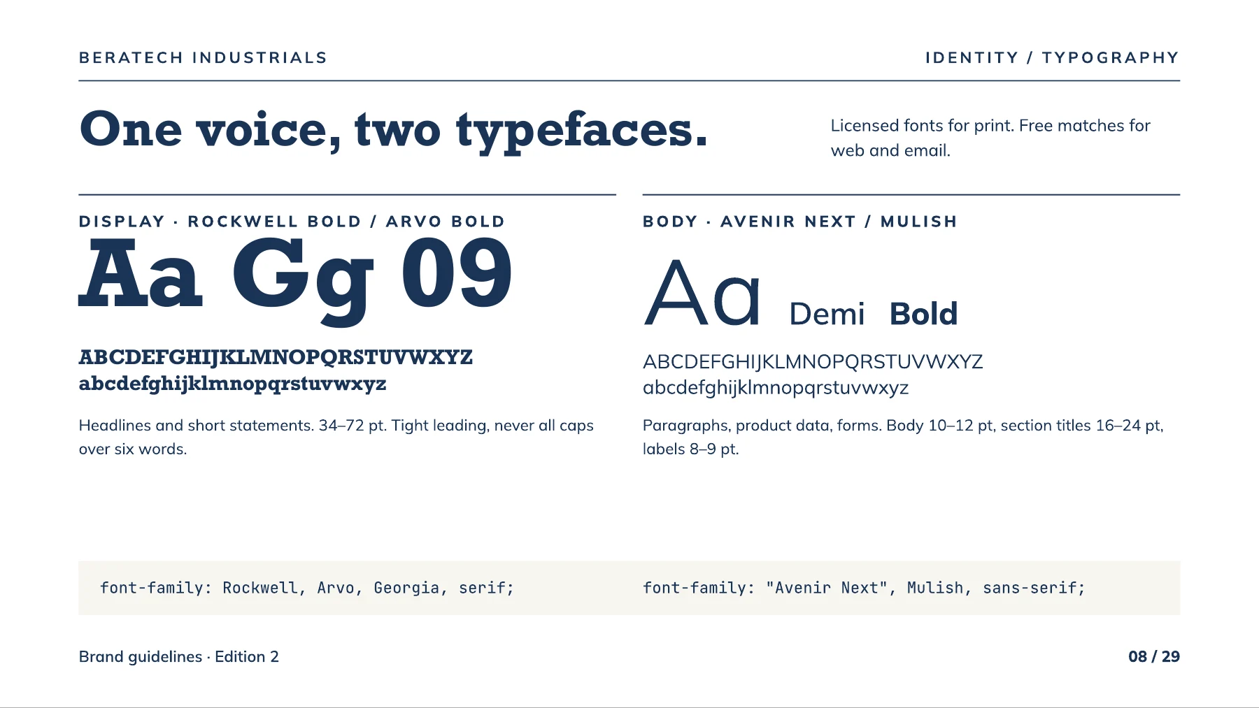
The work connects those applications through a shared visual language: a distinctive badge, a purposeful palette, consistent typography, and clear rules for everyday use.
Recognition, with a purpose.
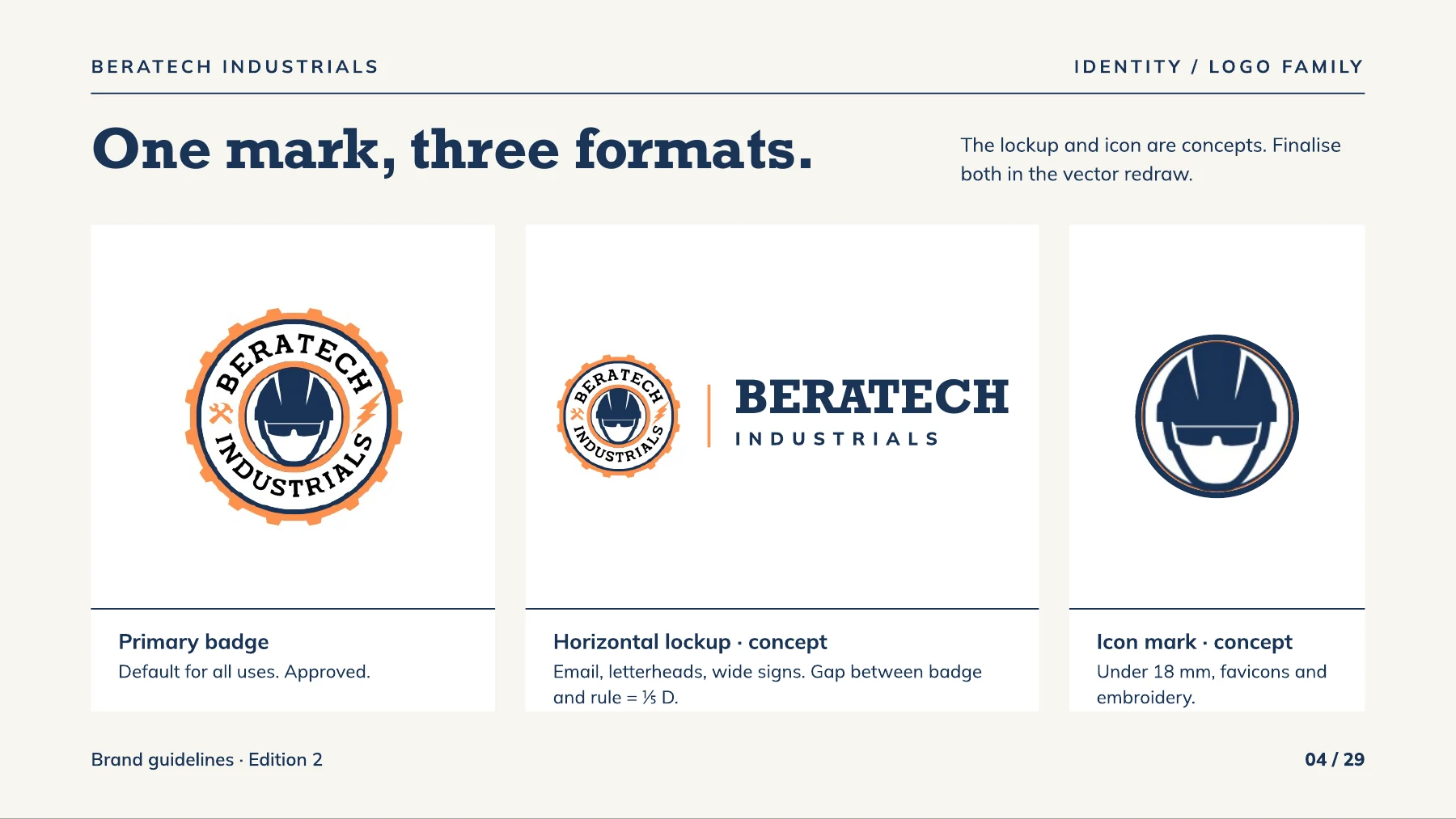
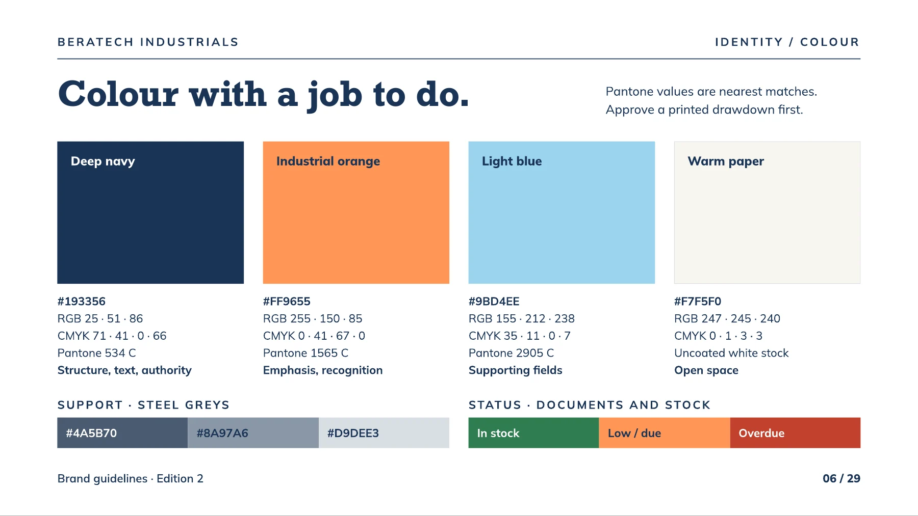
Deep navy gives the system structure. Industrial orange creates emphasis. The badge, horizontal lock-up, and compact icon give the same identity different ways to work.
 View artwork ↗
 View artwork ↗
 View artwork ↗
Beyond the logo.
The print kit takes the identity into production detail: placement, dimensions, materials, and colour combinations. These are application designs from the client deliverables, shown here as artwork.
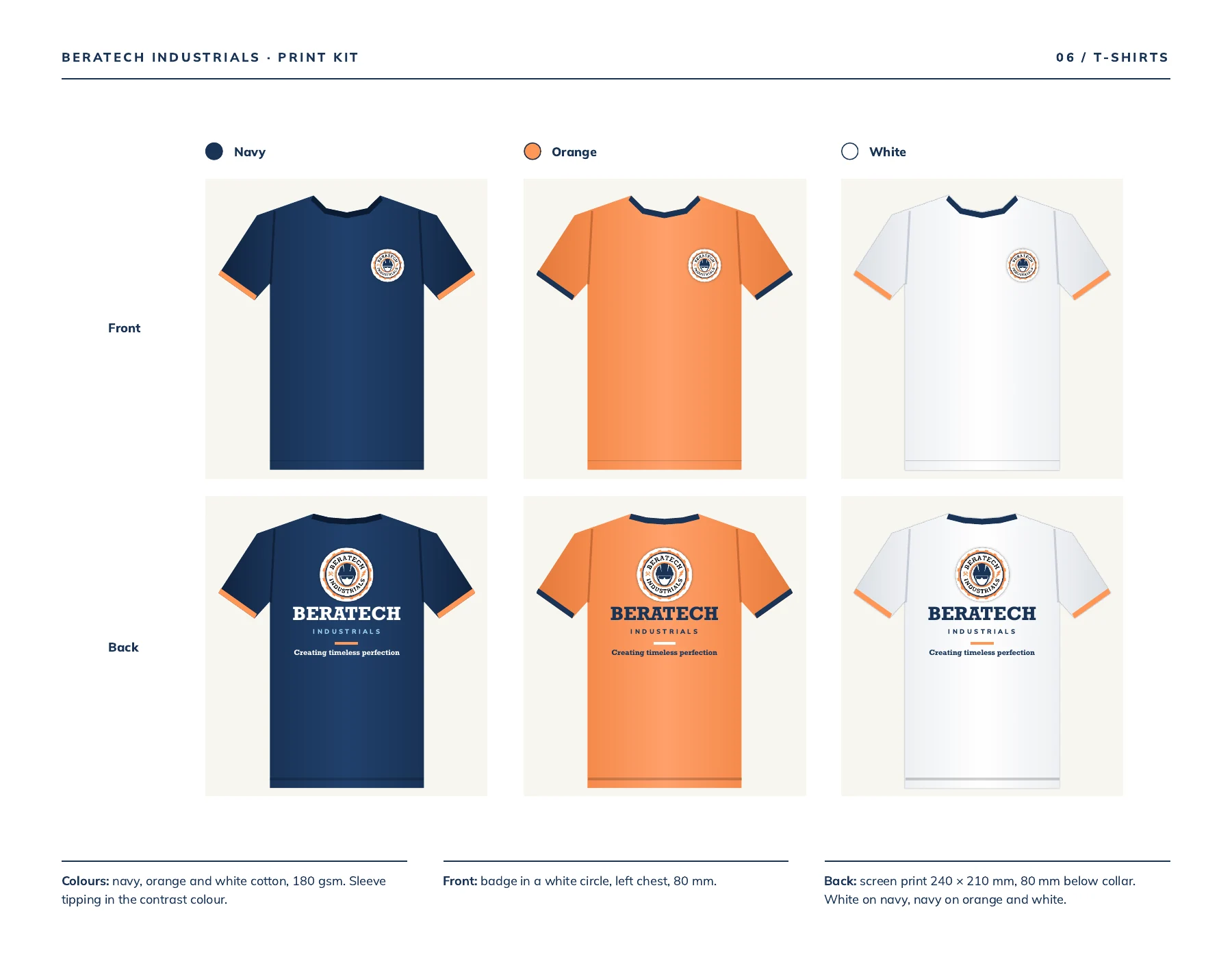 View artwork ↗
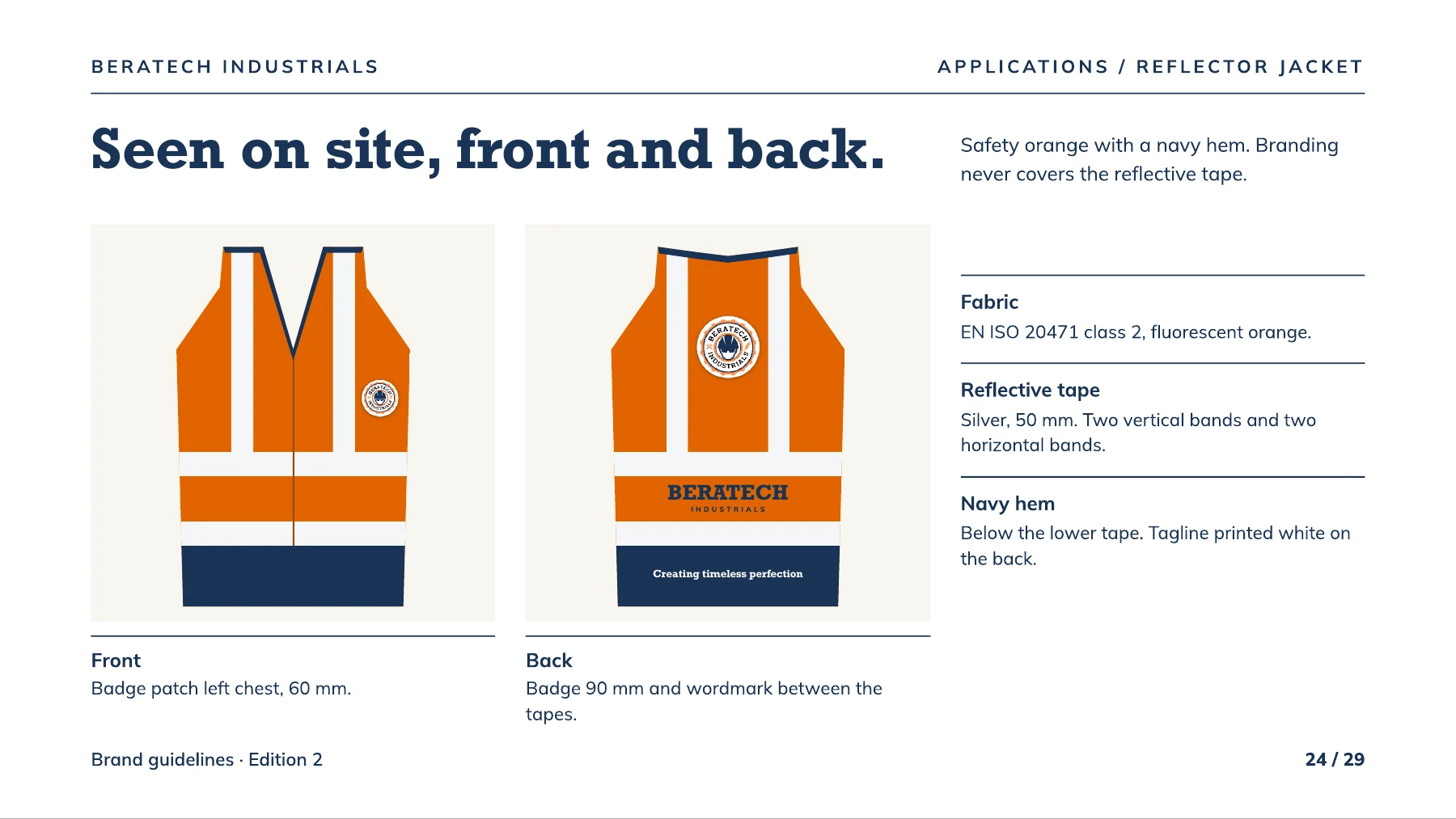 View artwork ↗
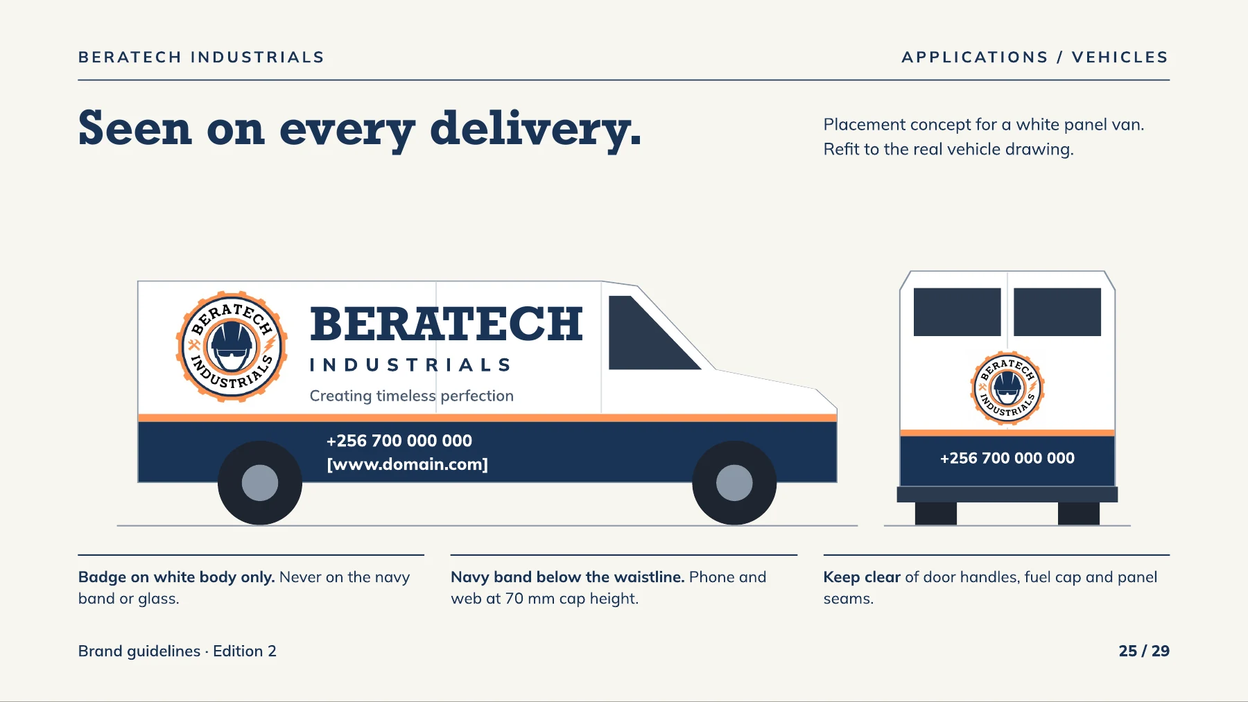 View artwork ↗

The brand in
the details.
Letterheads, quotations, invoices, purchase orders, and receipts are part of how a business presents itself. The A4 stationery system carries the same hierarchy and visual language into those daily interactions.
The letterhead is shown here. The financial forms remain in the client’s working files.
ORIGINAL ARTWORK / REFINED A4 STATIONERYA brand system people
can put to work.
The design package brings the identity rules and practical applications together. It gives the business a consistent reference for its printed materials, communications, and physical presence.
Let’s talk about your brandGuza
Commerce & merchant identity